

iORBIT at MEDICA 2026 – Meet Us at Hall 16, Booth A35
November 11, 2026iORBIT at MEDICA 2026 – Meet Us at Hall 16, Booth A35
November 11, 2026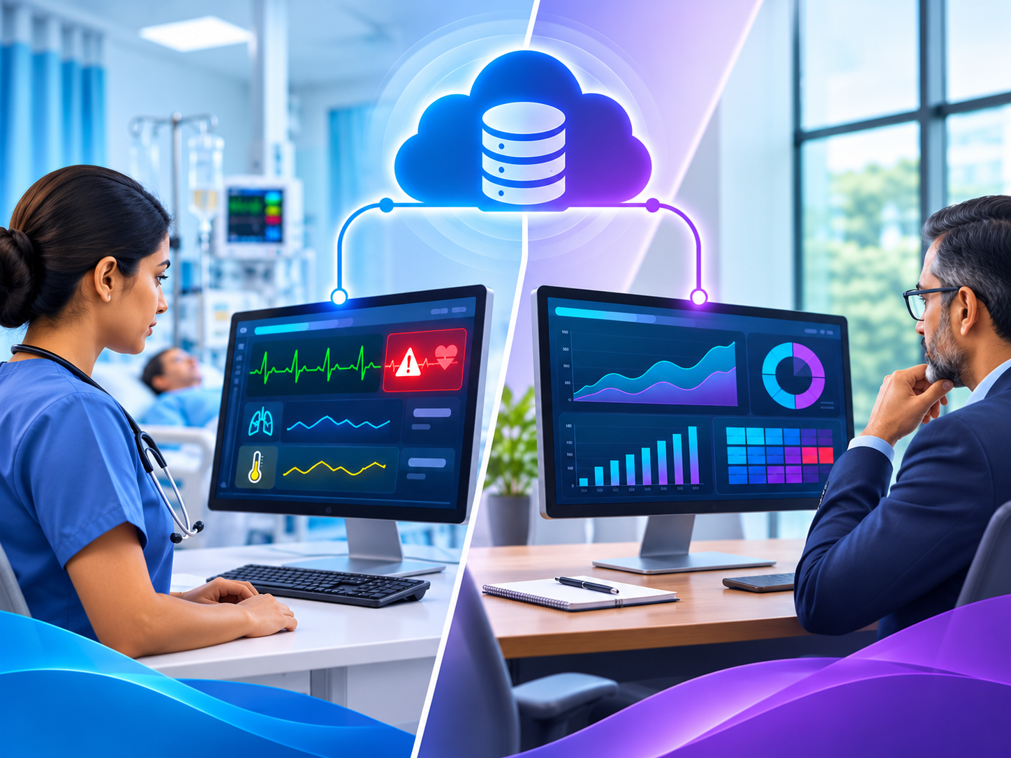
Beyond Monitoring: How Visualization, Dashboards, and Notifications Empower Clinicians
Data presentation shapes decision-making at the bedside and the boardroom - not just data collection.
Collecting patient data is only half the job - how that data is presented determines whether it actually gets used well. A perfectly accurate reading, buried in a cluttered screen or delivered as raw numbers, helps no one. This article looks beyond monitoring itself tothe healthcare data visualization, dashboards, and notification designthat turn collected data into decisions - for the nurse at the bedside and the administrator in the boardroom
Healthcare data visualization is as important as the monitoring itself. Most conversations about patient monitoring focus on what's being measured - vitals, device readings, lab values. Far less attention goes to a question that matters just as much: once that data exists, how does a person actually make sense of it, quickly, under pressure?
This is where visualization, dashboards, and notifications become as important as the monitoring itself. The same underlying data can either overwhelm a clinician with numbers, or present a clear, immediate signal of what needs attention - the difference is entirely in the design of the presentation layer.
Why Healthcare Data Visualization Is Not an Afterthought
Three problems show up when data presentation is treated as secondary to data collection:
- Cognitive overload. A screen full of raw numbers forces the viewer to do the interpretation work that good visualization should do automatically.
- Missed context. A single value without a trend line hides whether a patient is improving, stable, or declining - the direction matters as much as the number.
- Notification fatigue. Poorly designed alerts that don't distinguish urgency train staff to tune out notifications altogether, including the ones that matter.
Two Audiences, Two Very Different Needs
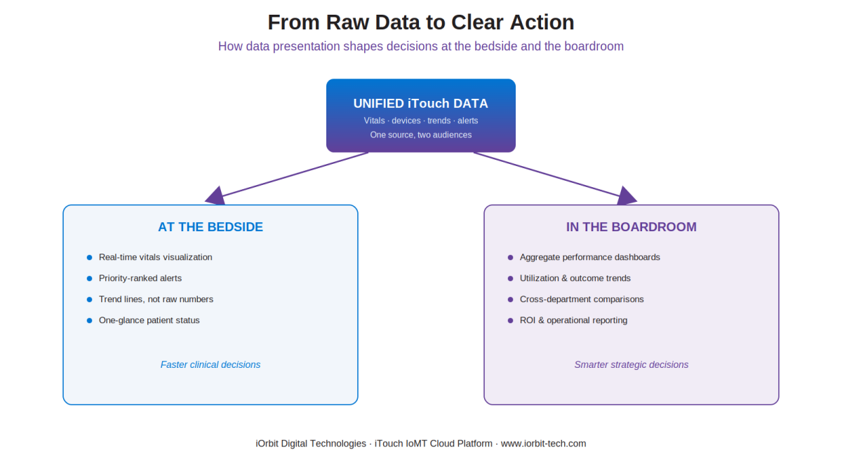
At the Bedside: Speed and Clarity
A clinician glancing at a monitor needs an answer in seconds, not minutes. Effective bedside visualization prioritizes: real-time trend lines over static numbers, color and priority cues that make abnormal readings visually obvious, and layouts that surface the most clinically relevant information first, without requiring the viewer to hunt for it.
In the Boardroom: Patterns and Performance
Administrators and department leaders need a different view entirely - aggregate trends across units, utilization patterns, and outcome metrics over time. This is where dashboards built on the same underlying data serve a completely different purpose: not immediate action, but strategic insight. It's the same principle behind data-driven decision-making across a hospital network, just applied at a different altitude.
Both audiences are drawing from the exact same unified data stream - the difference is entirely in how that data is visualized and delivered. Good presentation design doesn't just make data look nicer; it determines whether a nurse catches a deteriorating patient in time, or whether an administrator spots a costly inefficiency before it compounds.
What Makes a Notification System Actually Work
Notifications are the bridge between data and action - but only if they're designed to be trusted. Key principles include:
- Priority-ranked, not uniform. A critical deterioration alert should look and feel different from a routine reminder.
- Routed to the right person. Notifications should reach whoever can actually act, not everyone indiscriminately.
- Context-rich. A useful alert includes enough information to act immediately, not just a bare trigger that requires further investigation.
- Configurable by role. What a bedside nurse needs to see differs from what a charge nurse or physician needs - notification design should reflect that.
Notification design is also a patient-safety issue: a 2022 systematic review of alarm fatigue in intensive care found that 72% to 99% of patient monitoring alarms are false or clinically irrelevant.
How iTouch Approaches Visualization and Dashboards
The iTouch IoMT Cloud Platform is built with this presentation layer as a core design consideration, not an afterthought. Real-time dashboards adapt to the viewer's role, trend visualization replaces raw data dumps, and the same underlying rules engine that powers clinical alerts also feeds executive-level reporting - so both audiences get views purpose-built for their decisions, from one unified source of truth.
Future-proofing a hospital IT investment isn't about picking the technology that looks best today - it's about preserving the freedom to adapt as needs, standards, and vendors change. Vendor-neutrality is what makes that freedom possible. Every dollar spent on a vendor-neutral foundation is a dollar that keeps working for your organization, not against it, for years to come.
See Data That Actually Drives Decisions
If your current systems collect plenty of data but leave clinicians and administrators doing the interpretation work themselves, it may be time to rethink the presentation layer. Explore how the iTouch IoMT Cloud Platform turns unified data into clear, role-specific visualization.